Call To Action – Tell Them What To Do

In Conversion Optimisation we try to think about how users interact with a site, what they are looking for and what design, elements and text will help persuade them to do a desired action. The Call To Action (CTA) is one area that is often overlooked, we still see sites that have big buttons that just say “SUBMIT” or “MORE INFO” yet the reality is just a little bit of thought would boost conversion quite significantly.
Conversion optimisation relies on various factors but the one potential bottleneck is your landing page and not having effective call to action buttons or links, you’ve gone to the trouble of targeting via themed AdGroups, writing compelling and highly relevant Ads, landed the clicker on the most relevant page on your site, and then left your landing page design and story to try to build interest, desire and finally action, yet it’s your call to action that might be letting you down.

Bear in mind that when writing Call To Action text people are usually trying to solve a problem or need that they have, so your product may be a drill but in reality they need a hole, you may sell sporting coats but they really need a warm and waterproof jacket etc. You may sell insurance but they are buying protection, peace of mind or security for their family so think about what words and short phrases that would trigger your users into clicking as it’s what they need.
Our key approaches are :
Trigger Words – These are simple words and key phrases that resonate with your users, if they are looking for a free trial then “Free Trial” would help conversion more than “Read More”.
‘Ronseal’ Names – Ronseal has a reputation for their products doing what it says on the tin, and your CTA’s should be the same, don’t use “Submit” buttons as that’s very dated and subliminally it’s like a command with negative connotations. Internet users have seen thousands of sites and somethings are pretty consistent so don’t get too inventive with the basic Call To Action commands i.e use “Read More” instead of “See Why”.
Slow Date – There seems to be a trend of trying to get a sale made or lead taken sooner and sooner yet you are asking for some commitment just for even an email address these days as they expect to get spammed so your landing page should have trust elements on there (Testimonials, accreditations, reviews stars, partner logos, “as seen on/in” logos etc.) so think about breaking down the the journey into compliance steps.
Egyptian shop owners have this down to an art, they ask you to sign their guestbook, they then give you a cup of steaming hot tea, they then give you free samples, they build rapport by telling you about a relative that lives in your city and how your football team is great, they then sell you stuff you never wanted. (This also relies on reciprocity a little too as you feel like they were nice, free tea and samples etc. deserves some payback).
Don’t try to sell from the outset focus more on telling your story, build the trust, show why they should buy/work with you then ask for a smaller commitment. We do this on our landing pages and sites by having call to action/call me back mini forms around the sites so people can do the action as soon as they like but they can keep reading until they are ready to convert as we lay the story out logically so the conclusion call to action leads them to the next step.
Friends With Benefits – If you can add some benefit statement around your call to action then that helps, “Try Free Now – No Credit Card Required” is stronger than “Try Free Now” as it implies less commitment and you really can try it for free. Other examples could be :
Social proof – “Subscribe now Free and join 108,567 subscribers” (numerous)
Speed/low effort – “Get Started Now! – Sign up in 60 seconds” (numerous)
Free – “Get Started (it’s Free)” (numerous) (Eventbrite)
Information, implies not asking for commitment just yet – “Learn More” (numerous)
Financial – “Save for something big” (Airbnb)
Benefit – “Get started and say goodbye to spam” (Akismet)
Action – “Click to look inside” (Amazon)
Incentivised – “Unlimited access for $50” (appstemplates)
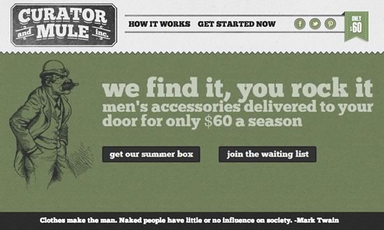
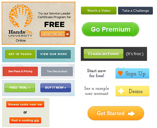
Alternative – “Get our summer box” “Join the waiting list” (Curator And Mule Inc)
Prestige – “Go Premium” (Skype)
Motivational – “Get Started” (Dailymile, ZeroCater)
Timed – “Limited Time Only” (HandsOnNetwork)
Creative – “Create Your Store Now” (Shopify)
Tour – “Try it free for 30 days” or “Take a Quick Tour” (Freshbooks)
Portfolio – “Get In Touch” or “View Our Work” (TheoryDesign.ca)
View – “See The Collection” (Curator And Mule Inc)
Challenge – “Watch a Video” or “Take a Challenge” (KhanAcademy)

The key really is to test Call To Action text, buttons and position on the page, even if your conversion is rocking, you still might be able to improve it, if not they at least you know you can take comfort in the fact that you are squeezing every possible conversion out of your Call To Actions, but do test them, don’t just assume you are getting the best you can get.


