Google Tinkering With Brand Listings

We’ve been seeing some brand related results flux around today, it would seem Google are testing different formats, below are a few screenshots on highlighting subtle differences :
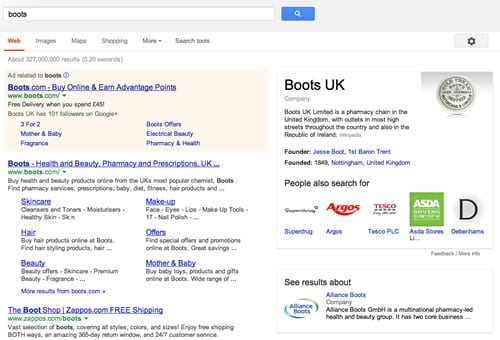
On a Boots search we are seeing the listing above, surprisingly, and probably quite annoyingly for Boots, other brands are there now to the right, Superdrug, Argos, Tesco, Asda and Debenhams all have their logos and a link featured under a new “People also search for” section.
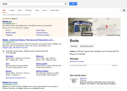
Below is another version of the Boots page, you’ll notice some differences :

There’s a location listing, the Boots listing itself is now boxed in with local map, then a company summary to the right side.
Below is yet another version of the Boots listing :
In the listing above Geo-location is featuring with local listings and even photographs of the nearest store to where we are located, as well as a small map and a box about the company again.
I think most brands would be happy with screens 2 and 3 but not so thrilled at the first image featuring other retailers logos and links.
The listing for Argos is below, shows differences between Google.com and Google.co.uk :
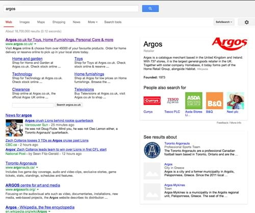
Above you can see the logos in action again, some more boxed, but unrelated Argos content and a Search argos.co.uk box, which when searched leads to Google’s indexed list of Argos contents, not the Argos site, Google is trying to keep users on site again here, if they find what they are looking for then they’ll click through to Argos, if not then they will stay on Google and do another search.
Below is the Argos site as listed on Google.co.uk :
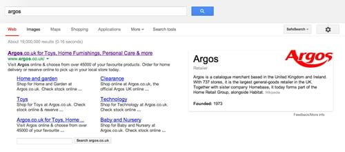
Note there are no competitor brand logos or links and the ‘see results about’ box is not here either.
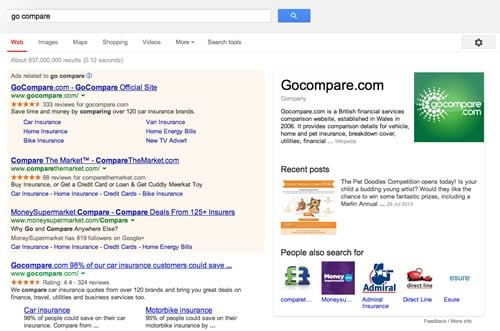
On a financial brand like gocompare.com the listings and PPC are Company information box are fitting together quite well, although in that area above the fold there are now 7 other companies mentioned and 5 other logos visible now :
It would seem there is some testing going on here by Google, and the interesting (or distressing depending if you are the sector leading merchant) thing to note here is that if you click one of the logo links, in this case MoneySupermarket you get this screen:
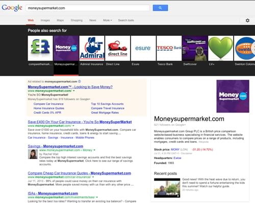
Suddenly you are assaulted with 8 other brand logos in quite an imposing way. It would seem that Google is trying to push traffic around brands, maybe this is to engage them more, they pushed people onto main keywords with their predictive search in the search box and now it would seem that they are purposely creating brand awareness of other brands with this feature, this could be good for the merchants with less market share but could be annoying/costly for the market leading brand in each sector, only time will tell of the impact.