How Images Can Boost Conversion Rates and Persuade Your Customers

People love images: over 300 million photos are uploaded to the internet every day. But that doesn’t mean all images are created equally, or there isn’t a subtle art to choosing the right ones.
The psychology of images is complex and fascinating, and understanding it will help you drive more conversions and create more persuasive campaigns. In this article, we’re going through seven things you need to remember when using images in your marketing.
1. Always use high quality images
The quickest way to convince your customers that what you sell isn’t very good is by photographing it poorly. Not only does it make your products look bad – it makes you look, as a brand, appear amateurish.
Make sure you use high quality images – preferably original ones. They should reflect your brand identity both in terms of the quality of the photography/design and the mood of the image.
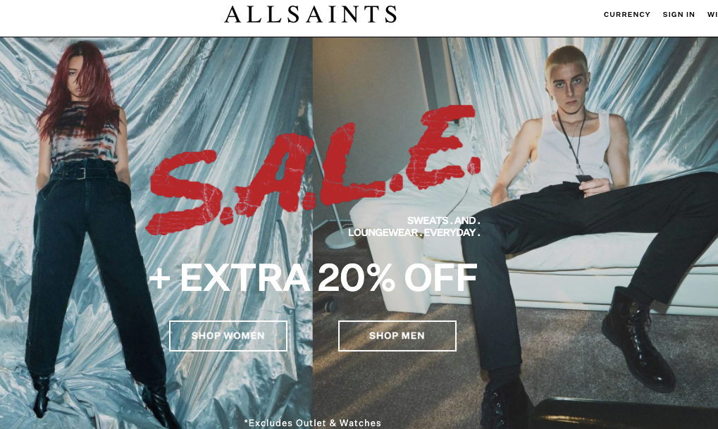
Example
Fashion brands have to be particularly diligent about the quality of their images. Check out how All Saints reflect their brand’s slightly edgy image in this pair of professionally shot photos:
2. Provide the right context
It’s important to remember that product images are not just trying to convey what the product is, but what it will be used for and how it will feel to own it.
Providing the right context means determining what your customers want to feel about their purchase, the kind of lifestyle they expect it to provide them with and who they want to be.
Example
Furniture never exists in isolation, so most brands will include a full, professional designed interior in their product shots to help customers visualise their purchase. Check out how MADE place their sofa in a carefully assembled, tasteful context:

3. Understand your audience
In articles like this, it’s easy to forget that all customers are not the same. Depending on your brand, your customers may want highly stylised images or totally natural shots.
Understanding the way your audience sees themselves and what they want from your brand is crucial, and too often marketers turn off customers with imagery that isn’t suited to the customers’ taste at all.
Example
Hobbs is a popular fashion brand, but they understand that their audience aren’t the type to go for OTT imagery. Instead, they mirror their customers’ desire for sophistication and elegant simplicity with carefully framed images that are somehow both eye-catching and modest:

4. Tap into your customers’ emotions
Part of the reason images are so effective is their emotional immediacy: rather than thinking about how a product will feel, images can communicate that feeling in a more direct, visceral way.
Humans have an innate ability to read each other’s emotions – particularly from facial expressions – and this ability is extremely useful for marketers, given that 95% of purchasing decisions are made subconsciously, via the emotions.
It’s also important to remember context here: the emotions you evoke should be in-line with your product or service. Soothing imagery is great for selling furniture or meditation courses, but not so much for extreme sports equipment.
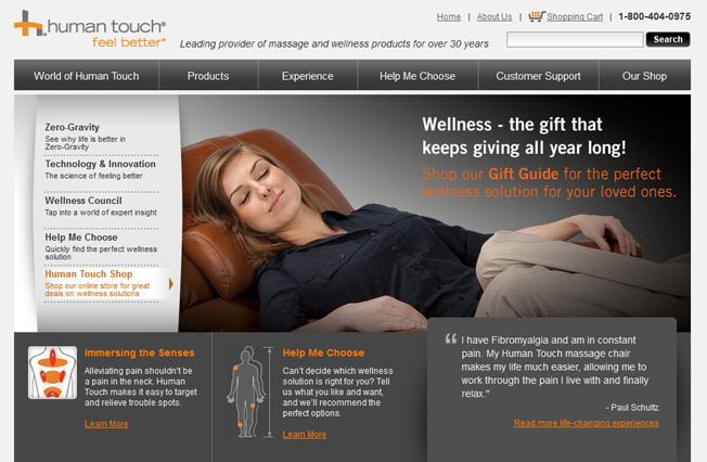
Example
Human Touch sells massage and wellness products, meaning they want their audience to appreciate the power of relaxation and calm. Check out how their website uses a model’s facial expressions and posture to convey those calm feelings:
5. Mirror your images with copy
Most marketers treat image and copy as fundamentally separate, leaving copywriters and art directors to work separately and simply combine what they produce at the end.
By working differently, so that the imagery and wording actually reflect each other, creates a far larger impact on the audience. The right copy can amplify the emotion or context your imagery is creating, making both far more persuasive.
Example
Asos already had a cool, well-shot set of images here, but by subtly matching the copy with the model’s poses – ‘Smart Moves’ – they give the visitor a little buzz of pleasure which is similar to solving a puzzle.

6. Use colour psychology
The colour of an image is usually chosen simply for aesthetic reasons, but this overlooks the powerful impact colour choice has on mood. You should seriously consider the sort of response you want the audience to have, then use colour psychology to evoke it.
Here’s a quick summary of the basic colours and their uses in marketing:
Yellow – youthful and positive; very common in shop windows
Red – energetic and urgent; great for large wholesalers and clearances
Blue –trust and dependence; popular with banks and corporate businesses
Green – health and positivity; popular for wellness products
Orange – aggressive; great for CTAs, prompting a quick response
Pink – feminine and romantic; often used in to target younger women
Black – simple and powerful; very common with luxury goods
Purple – soothing and calm; often used by beauty or anti-aging brands
Example
Look at how Beauty Bay – a cosmetic seller – uses a soft, pastel purple to create a sense of relaxation on their website:

7. Make your images interactive
As we’ve discussed, images are everywhere. And while you can win over customers with better quality, more relevant images, novelty is still a vital ingredient when persuading your audience to convert.
Making your images interactive – whether it’s a 360 degree swivel effect or just being able to zoom in with high-definition – will cause customers to spend longer on your site and feel more satisfied that they’ve got a clear view of the product.
Nobody wants to buy anything without feeling they’ve seen what it is, and interactive, immersive imagery is a great way for digital marketing to bridge this gap with the real world.
Example
Including multiple shots of a product from different angles helps, but Under Armour go one better by actually providing a 360 degree interactive video of these shoes: