Reduce Friction – Boost Conversions

In online marketing when you ask people to do something more of them will do that desired action if it’s easy and quick to do and they trust you. One big innovation came years ago when merchants started to save your details so you didn’t have to refill them each time you wanted to purchase, Amazon has taken this a step further with “one click” ordering; the ultimate friction free shopping but there are accessible ways that you can improve you website to reduce friction and increase conversions.
Your online lead or sales process should have some thought into it and depending if it’s a lead generation site or a sales site different thoughts will take the lead. For sales sites trust is a big issue that needs plenty of work, as does the checkout procedure and delivery information so be very clear on delivery information with timescales and pricing (free delivery is a HUGE friction reducer too!) and a strong call to action buttons with obvious data fields will reduce friction further.
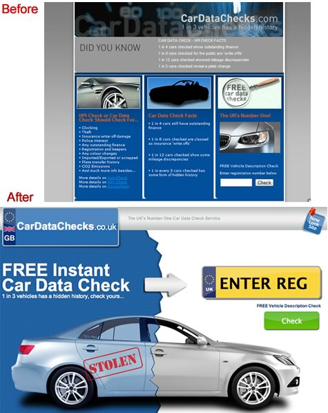
Take a look at the example below where we put far more emphasis on the Registration box (users had to hunt for it before) and the call to action button, we put all the supporting information below the new area so it’s there for those users that need more info but out of the way for returning users and those that make faster decisions, you’ll also note we added a “New look site” image at the top so as many users are daily repeat visitors so we didn’t want them to think they were on the wrong site as it’s such a big change in design, we also had them default back to the .co.uk domain as it’s a UK only service and the .com is often perceived by users to be a USA site (hence the GB and Union Jack in the site name/logo too) :

The page has a far better flow too, users land, read the value proposition, their eye is drawn by the arrow over to the registration box and then the “Check” button, conversion increased by 110% over the old page with the hard to find text box and small call to action button.
For a lead generation site considerations such as collecting only as much information as you need to service the lead (why ask for a full address if you are ringing someone and don’t need it until you speak to the lead?). Too many sites have huge data capture forms that users get fed up with. If you must collect multiple fields try to break up big forms into 2-3 steps, but make the user aware where they are at each step : “Step 2 of 3” etc.
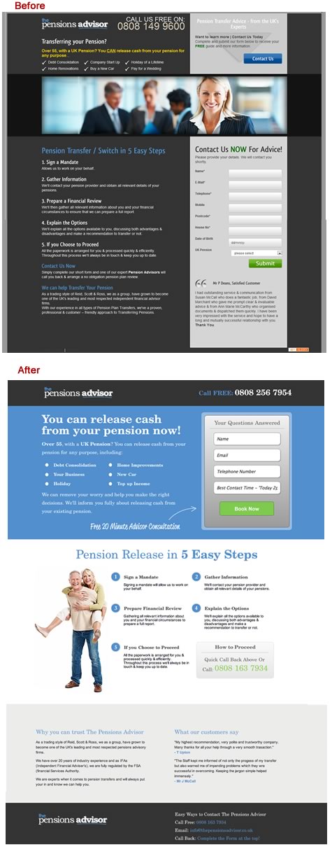
Below we cut fields from 8 to just 4 on the form and substantially boosted the conversion rate as a result, you’ll note other friction reducers that build trust such as testimonials, prominent use of a freephone number three times instead of just once, clear contact information at the bottom of the page too.

You’ll also see that the 5 steps are far more clearly shown and the page has a more upbeat vibe to it too, Conversion increased substantially after implementation.
The main points to consider when reducing friction are :
Shorter forms
Value proposition
Core benefit statement
Case studies
Media coverage
Prominent company/contact details
Trust indicators (professional accreditations as well as security certificates/awards and testimonials)
Clear jargon free language
Clean design with minimal distraction
Logical flow to the page, a path to direct users through to your desired goal
A good landing page will be clean and display elements to reduce conversion friction such as those below :

Don’t forget to test social media plugins if it’s appropriate for your service or products, but only implement social media proof when you have plenty of fans as “9 people like this” isn’t very strong and could be harmful compared to “7,142 people like this”.
Treating conversion friction reduction the same as landing page optimisation is the best way forward, don’t assume that just because you like the page other people will, your tastes aren’t important; what converts best is! So test many different elements and layouts to find the best converting page with the lowest conversion friction, don’t just stop once you’ve doubled conversion, you still may not have the best combination of elements and layout.


